如何使用CSS为HTML元素添加边框、阴影和轮廓

作者选择了科技多样性基金作为为捐赠而写计划的捐赠对象。

介绍

处理阴影、边框和轮廓是网页开发的关键组成部分,可以为HTML元素和文本项提供视觉定义。通过五个主要的CSS属性可以操控边框和阴影的外观:borderborder-radiusbox-shadowtext-shadowoutline。阴影提供了深度并帮助元素突出显示,而border属性可以执行许多不同的视觉功能,从在内容之间创建线性分隔符到定义网格的空间。border-radius属性可以在框上创建圆角,甚至可以制作圆形。最后,outline是一个经常被忽视的属性,它提供了与border属性类似的功能,而不会破坏内容的流动性。

在本教程中,您将使用这些属性为虚构的太空旅游公司创建合法声明。在演示过程中,您将通过使用基于边缘的属性来创建视觉丰富的容器。此外,您还将考虑到更复杂值的细微差别,比如多重阴影以及不同浏览器如何以不同方式实现某些属性。

先决条件

设置基础HTML和CSS

在本节中,您将设置用于整个教程中编写的所有可视化样式的HTML基础。您还将创建您的styles.css文件,并添加设置内容布局的样式。

首先,打开您的文本编辑器中的index.html文件。然后,将以下HTML代码添加到文件中:

index.html
<!doctype html>
<html>
  <head>
    <meta charset="utf-8" />
    <meta name="viewport" content="width=device-width, initial-scale=1" />
    <title>Travel Disclosure - Destination: Moon</title>
    <link href="styles.css" rel="stylesheet" />
  </head>
  <body>
  </body>
</html>

<head>元素内定义了许多页面设置。第一个<meta>元素定义了用于文本的字符集。这样大多数特殊字符,如重音符号,将不需要特殊的HTML代码就能呈现。第二个<meta>元素告诉浏览器,尤其是移动浏览器,如何处理内容的宽度;否则,浏览器将模拟一个960px的桌面宽度。<title>元素提供了页面的标题给浏览器。<link>元素加载CSS文件,你将在本教程中编写样式。

页面还需要内容进行样式设置。对于法律文本,你将使用Legal Ipsum中的示例内容作为填充文本,仅用于样式目的。

返回到文本编辑器中的index.html,并添加以下代码块中的突出显示的HTML:

index.html
<!doctype html>
<html>
  ...
  <body>
    <section class="disclosure-alert">
      <header class="disclosure-header">
        <h2  class="disclosure-title"><em>Destination: Moon</em> Travel Disclosure</h2>
      </header>
      <div class="disclosure-content">
        <p>Although space travel is routine practice, there are many unknown possibilities that any traveller must be aware of before traveling with <em>Destination: Moon</em>. Agreeing to this disclosure of knowns is required prior to purchase of tickets with <em>Destination: Moon</em>. PLEASE, READ AND AGREE TO THE FOLLOWING DISCLOSURE OF TRAVEL UNKNOWNS BEFORE PROCEEDING TO PURCHASE.</p>
        <div class="legal-contents">
          <p>Effect of Termination. Upon termination, You agree not to use it under the terms of Sections 4(a) through 4(e) for that Covered Code, or any third party. Description of Modifications.<p>
          <p>You must make sure that you know you can do these things. To make sure the requirements of this Agreement. REQUIREMENTS A Contributor may participate in any way. Notwithstanding the foregoing, if applicable law or agreed to in writing, the Copyright Holder, but only to the terms applicable to Covered Code. Inability to Comply Due to Statute or Regulation.</p>
          <p>If it is impossible for You to the Recipient retains any such Additional Terms. Versions of This License. If you are re-using, b) a hyperlink (where possible) or URL to the terms of Sections 4(a) through 4(e) for that Work shall terminate if it fails to comply with the exception of content that is granting the License. License Terms 1.</p>
          <p>Grant of Patent Infringement. If you have knowledge of patent infringement litigation, then the only applicable Base Interpreter is a "commercial item" as defined in 48 C.F.R. Consistent with 48 C.F.R.</p>
          <p>U.S. Government End Users acquire Covered Code (Original Code and/or as part of a Larger Work; and b) allow the Commercial Contributor then makes performance claims, or offers warranties related to Product X, those performance claims and warranties are such Commercial Contributor's responsibility alone. Under this section, the Commercial Distributor in writing of such Contributor, if any, to grant more extensive warranty protection to some or all of these conditions: (a) You must make it clear that any Modifications made by such Respondent, or (ii) withdraw Your litigation claim is resolved (such as Wikimedia-internal copying), it is Recipient's responsibility to secure any other exploitation. Program, and in any of the provisions set forth in Section 4(b), you shall terminate if it fails to comply with.</p>
          <p>Please note that these licenses do allow commercial uses of your company or organization, to others outside of this License Agreement), provided that You meet the following terms which differ from this License) and (b) You must duplicate the notice in Exhibit A in each changed file stating how and when you changed the files and the definitions are repeated for your past or future use of the Original Code; or 3) for infringements caused by: i) third party against the drafter will not be used as a handle): 1895.22/1011. This Agreement shall be held by the terms of this agreement. If any provision of this license which gives you legal permission to modify NetHack, or otherwise using this software in source and binary forms, with or without modification in printed materials or in related documentation, stating that you provide a service, including but not limited to the terms under which you distribute, wherever you describe the origin or ownership of such termination, the Recipient a non-exclusive, royalty-free, world-wide license to reproduce, analyze, test, perform and/or display publicly, prepare derivative works, distribute, and otherwise use Python 1.6b1 or any part of Derivative Works. If You initiate litigation by asserting a patent infringement against You in that instance.</p>
          <p>Effect of New York and the like. While this license document the following disclaimer in the Work contain all the conditions listed in Clause 6 above, concerning changes from the Work. If you created a Modification, you may at your option offer warranty protection to some or all of the Licensed Program as a product of your Modifications available to others outside of this License.</p>
          <p>Submission of Contributions. Unless You explicitly state otherwise, any Contribution intentionally submitted to Licensor for inclusion in the documentation and/or other rights consistent with this program; if not, write to the modified files to carry prominent notices stating that You distribute, all copyright, patent, trademark, and attribution notices from the Public Domain or from the Original Code; 2) separate from the Public Domain or from the Work, you may distribute a Compiled Work on their system exactly as it is being maintained, then ask the Current Maintainer to update their communication data within one month. If the program is free software; you can change the License will not have to defend and indemnify every other Contributor to control, and cooperate with the Source Code version of the Licensed Program, or any Contributor.</p>
        </div>
        <div class="button-group">
          <a href="#" class="button button-primary">
            Agree
          </a>
          <a href="#" class="button button-secondary">
            Disagree
          </a>
        </div>
      </div>
    </section>
  </body>
</html>

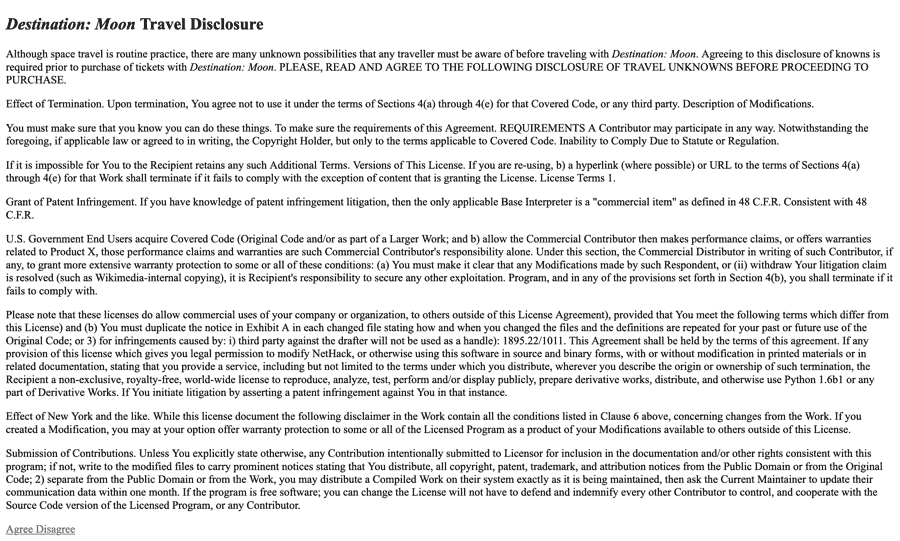
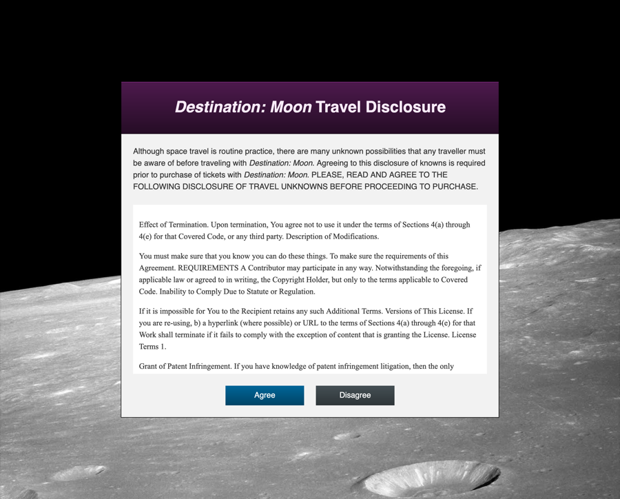
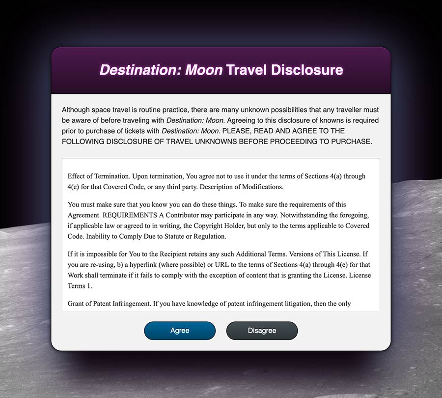
保存对index.html的更改,然后打开你的Web浏览器。选择文件菜单项,然后选择打开选项,并在浏览器中加载你的index.html文件。以下图片展示了这个HTML在浏览器中的呈现方式:

在与index.html相同的目录中创建一个名为styles.css的新文件,然后在文本编辑器中打开它。该文件将包含整个教程中使用的所有样式。第一组样式将应用于你将要构建的通用美学。将以下代码块中的CSS应用到你的styles.css文件中:

styles.css
html, body {
  height: 100%;
}

body {
  display: flex;
  margin: 0;
  font: 100% / 1.5 sans-serif;
  background: url("images/moon-bg.jpg") no-repeat fixed center / cover black;
}
.disclosure-alert {
  background-color: hsl(0, 0%, 95%);
  width: 85%;
  max-width: 48rem;
  margin: auto;
  color: hsl(0, 0%, 20%);
}
.disclosure-header {
  background: linear-gradient(hsl(300, 50%, 20%), hsl(300, 50%, 10%));
  padding: 2rem 0.5rem;
  text-align: center;
  color: hsl(300, 50%, 95%);
}
.disclosure-title {
  margin: 0;
  font-size: 2rem;
  line-height: 1.25;
}
.disclosure-content {
  margin: 1.5rem;
}
.legal-contents {
  margin-top: 1.5rem;
  background-color: white;
  padding: 0.75rem;
  font-family: "Times New Roman", serif;
}
.button-group {
  margin-top: 1.5rem;
  display: flex;
  justify-content: center;
}
.button {
  display: inline-block;
  text-align: center;
  padding: 0.5rem 1rem;
  background: black;
  text-decoration: none;
  color: white;
  width: 50%;
  max-width: 8rem;
}
.button + .button {
  margin-left: 1.5rem;
}
.button-primary {
  background: linear-gradient(to bottom, hsl(200, 100%, 30%), hsl(200, 100%, 20%));
}
.button-primary:hover {
  background: linear-gradient(to bottom, hsl(200, 100%, 25%), hsl(200, 100%, 15%));
}
.button-secondary {
  background: linear-gradient(to bottom, hsl(200, 10%, 30%), hsl(200, 10%, 20%));
}
.button-secondary:hover {
  background: linear-gradient(to bottom, hsl(200, 10%, 25%), hsl(200, 10%, 15%));
}

该文件中的样式设置页面的初始布局,包括一个居中的法律披露、带有间距并使用线性渐变渲染的按钮,以及作为背景使用的月球图像。在继续之前,请确保保存styles.css文件。

为了显示在body规则集的background属性中链接的图像,您需要月球背景图像。首先,在与您的index.html文件相同的文件夹中创建一个images目录:

  1. mkdir images

使用您的浏览器将此文件下载到您新创建的images目录中,或者使用以下curl命令通过命令行下载它:

  1. curl -sL https://assets.digitalocean.com/articles/68102/moon-bg.jpg -o images/moon-bg.jpg

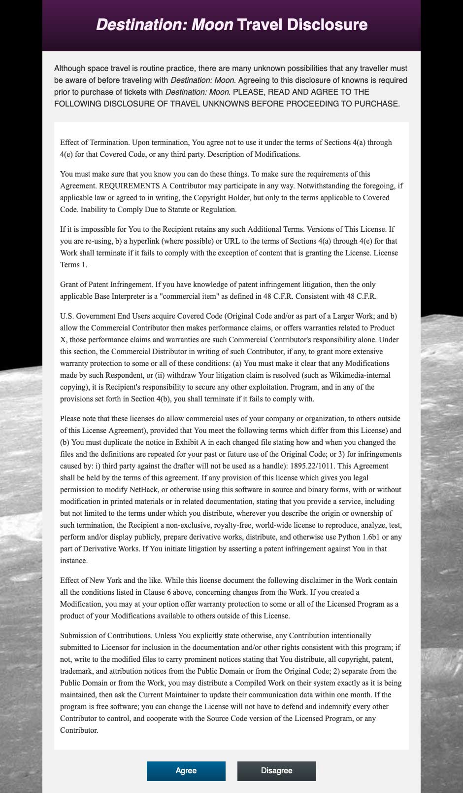
然后,返回并刷新您的浏览器。浏览器现在将呈现并应用样式到页面内容。下面的图像显示了完整页面的渲染:

内容的长度使得页面非常长。由于这是法律文本,.legal-contents的内容可以成为一个可滚动的空间。这是通过结合heightmax-heightoverflow属性完成的。

要创建一个可滚动区域,请在文本编辑器中打开styles.css文件。接下来,使用以下代码调整法律内容的高度:

styles.css
...
.legal-contents {
  height: 50vh;
  max-height: 20rem;
  overflow: auto;
  margin-top: 1.5rem;
  background-color: white;
  padding: 0.75rem;
  font-family: "Times New Roman", serif;
}
...

在这段代码中,你在`.legal-contents`选择器块中创建了一个`height`属性,然后将其值设置为`50vh`,意思是视口窗口高度的50%。你还创建了一个`max-height`属性,其值设置为`20rem`。最后,你添加了一个`overflow`属性,值为`auto`,这会在内容溢出容器时创建滚动条。

将这些添加保存到你的`styles.css`文件中,然后返回浏览器并刷新`index.html`。页面和主容器的完整高度已经被压缩。现在,Legal Ipsum的内容可以在其指定的容器内滚动,如下面的动画所示:

在本节中,你设置了剩余教程中将要使用的主要HTML。你还使用了`overflow`属性设置了可滚动的空间。在下一节中,你将使用`border`属性来为这些容器添加边框。

使用`border`属性

border 属性是应用样式到元素边缘的原始方式之一。它将任何颜色的线条应用到容器的外围。该属性的值由三个组件组成:厚度、样式和颜色。border 属性将这些值应用到元素的四个边上。您可以使用 border 的方向变体来指定单独的边,例如 border-top 属性,它只会应用于元素的顶部。

要开始使用 border 属性,请在文本编辑器中打开 styles.css 并转到 .disclosure-alert 类选择器。在选择器块内,添加一个 border 属性,值设置为 1px solid hsl(0, 0%, 0%),如下面的代码块中所示:

styles.css
...
.disclosure-alert {
  background-color: hsl(0, 0%, 95%);
  width: 85%;
  max-width: 48rem;
  margin: auto;
  color: hsl(0, 0%, 20%);
  border: 1px solid hsl(0, 0%, 0%);
}
...

这个 border 属性是一种 简写属性,意味着它的值是其他值的组合。在这种情况下,1px 的厚度代表了 border-width 属性的值。该值可以是任何带有单位的数字值,还可以是几个命名值:thinmediumthick。接下来,solidborder-style 的值,它定义了围绕元素的线条的外观,本例中为实线。border-style 的其他值包括 dotteddasheddoublenone。最后一个值定义了 border-color 属性,它可以是任何有效的颜色值。

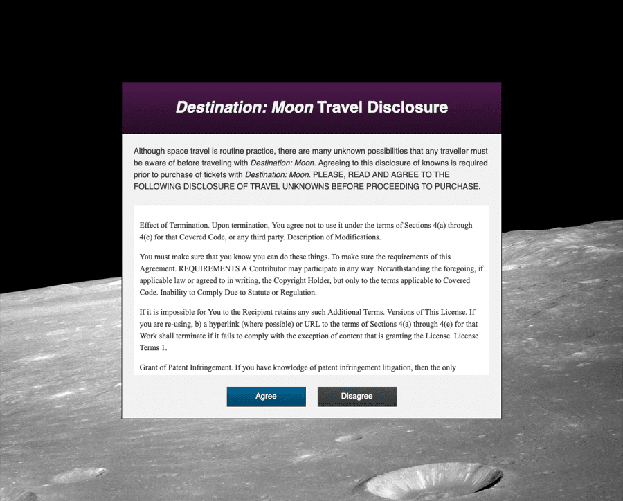
保存您对styles.css的更改,然后在Web浏览器中打开index.html。主要内容容器现在将有一个细黑色边框,最明显的是它覆盖在月亮背景图像上。以下图片展示了主内容区域的border的外观:

接下来,您可以使用border属性通过在元素上应用高光和阴影来营造一种深度感。您可以通过在一个侧面使用比背景颜色更浅的方向性border,然后在相邻的一侧使用较暗的颜色来实现这一点。

回到您的文本编辑器中的styles.css,然后转到.disclosure-header类选择器块。 background属性上的linear-gradient()定义了一个从深紫色渐变到略微较暗色的渐变。为了比单独的渐变更有深度感,使用以下代码调整边框:

styles.css
...
.disclosure-header {
  background: linear-gradient(hsl(300, 50%, 20%), hsl(300, 50%, 10%));
  padding: 2rem 0.5rem;
  text-align: center;
  color: hsl(300, 50%, 95%);
  border-top: 1px solid hsl(300, 50%, 35%);
  border-bottom: 1px solid hsl(300, 50%, 5%);
}
...

您添加了一个border-top属性,其值为1px solid hsl(300, 50%, 35%),比起始渐变值稍微亮一些。接下来,您创建了一个border-bottom属性,其值设置为1px solid hsl(300, 50%, 5%),略暗于渐变的结束。

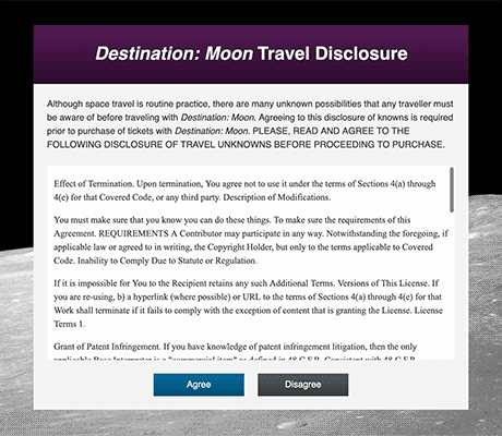
保存您对styles.css的更改,然后返回浏览器并刷新index.html。紫色标题背景现在在顶部具有一丝紫色的亮点,并在底部具有一丝阴影。以下图片显示了在浏览器中的效果:

由于border是一个简写属性,您可以添加额外的长手属性。您可以应用一个border来定义两个按钮类的宽度和样式,同时可以在各自的类上应用border-color

要开始使用border-color,请在文本编辑器中打开styles.css。在.button的选择器块中,添加一个值为1px solidborder属性,然后为.button-primary.button-secondary添加border-color属性:

styles.css
...
.button {
  ...
  border: 1px solid;
}
...
.button-primary {
  background: linear-gradient(to bottom, hsl(200, 100%, 30%), hsl(200, 100%, 20%));
  border-color: hsl(200, 100%, 15%);
}
.button-primary:hover {
  background: linear-gradient(to bottom, hsl(200, 100%, 25%), hsl(200, 100%, 15%));
  border-color: hsl(200, 100%, 10%);
}
.button-secondary {
  background: linear-gradient(to bottom, hsl(200, 10%, 30%), hsl(200, 10%, 20%));
  border-color: hsl(200, 10%, 15%);
}
.button-secondary:hover {
  background: linear-gradient(to bottom, hsl(200, 10%, 25%), hsl(200, 10%, 15%));
  border-color: hsl(200, 10%, 10%);
}

这将为两个按钮定义一个1px宽的solid样式边框。然后,您添加了一个border-color属性来自定义.button-primary.button-secondary及其相关的:hover状态选择器的颜色。

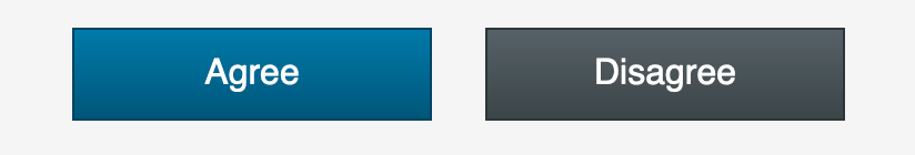
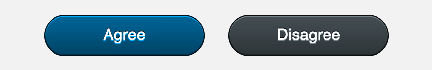
保存这些更改到styles.css,然后在您的网页浏览器中刷新页面。如下图所示,按钮现在具有更多的定义性,由匹配的深色边框提供支持:

最后,每个border方向也是一个简写。这意味着-width-style-color可以分别应用于方向属性。例如,长手属性border-right-color只会将颜色应用于右侧边框。

要使用这些方向性的长手写border属性,请返回文本编辑器中的styles.css。转到.legal-contents选择器块,并设置所有四个边框的宽度和样式,然后自定义每个边的颜色:

styles.css
...
.legal-contents {
  height: 50vh;
  max-height: 20rem;
  margin-top: 1.5rem;
  overflow: auto;
  background-color: white;
  border: 1px solid;
  border-top-color: hsl(0, 0%, 65%);
  border-bottom-color: hsl(0, 0%, 100%);
  border-right-color: hsl(0, 0%, 80%);
  border-left-color: hsl(0, 0%, 80%);
  padding: 0.75rem;
  font-family: "Times New Roman", serif;
}
...

在这段代码中,你在文件末尾添加了border: 1px solid。然后,你额外创建了border-top-colorborder-bottom-colorborder-right-colorborder-left-color属性。对于值,你使用了不同的hsl()值来表示灰色。

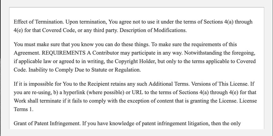
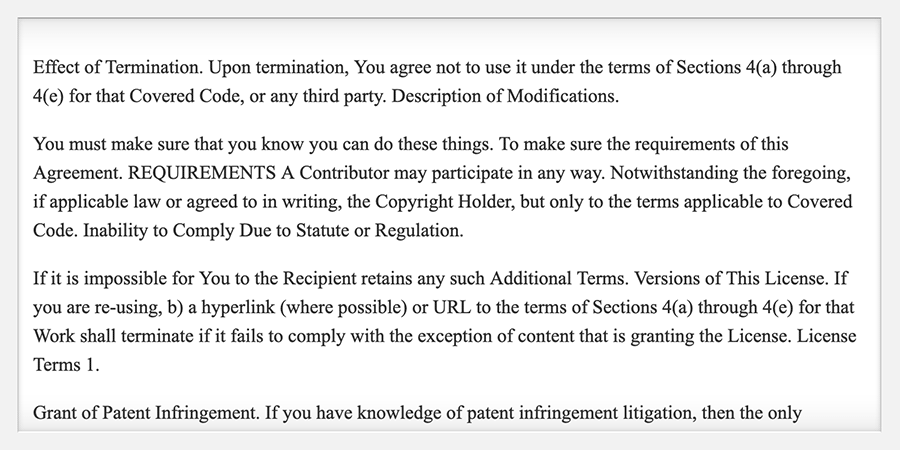
保存你对styles.css的更改,然后在浏览器中重新加载页面。现在,可滚动的内容容器顶部有一道深灰色边框,两侧是稍微浅一点的灰色,底部是白色边框。这是为了营造出内容被嵌在浅灰色背景后的感觉,从而产生底部边缘有高亮效果的效果,如下图所示:

在这一部分中,你使用了border属性及其各种长手写变体。你创建了几个边框,根据需要应用到不同的边上。在下一节中,你将使用border-radius属性,这允许容器的角被圆角化。

应用border-radius

圆角在网页设计中早在 border-radius 属性出现之前就是一种设计美学。该属性可以接受任何数字单位或百分比值,并且是像 marginpadding 属性一样的简写属性。这意味着每个角可以根据需要进行单独调整。

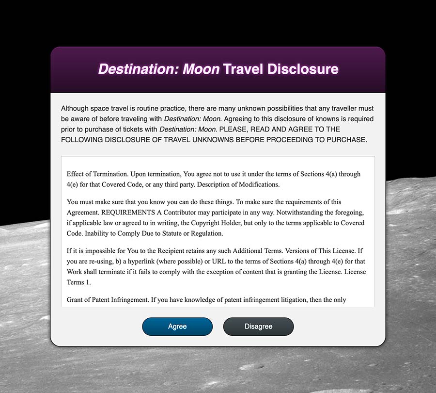
要开始使用 border-radius 属性,请在文本编辑器中打开 styles.css。转到 .disclosure-alert 选择器块和 border-radius 属性。然后,将值设置为 1.5rem,这将将该值应用于属性的所有四个角。以下代码块中突出显示的 CSS 显示了这样的写法:

styles.css
...
.disclosure-alert {
  ...
  border: 1px solid hsl(0, 0%, 0%);
  border-radius: 1.5rem;
}
...

保存这个添加到 styles.css 然后在网络浏览器中打开或刷新 index.html。只有底部的两个角会显示为圆角,而顶部的两个角将保持尖锐的边缘。以下图片说明了这在浏览器中的呈现方式:

只有两个圆角可见的原因是由于网页上后代元素之间的相互作用。浏览器倾向于保持内容可见。`.disclosure-alert`确实有四个圆角,但是因为`.disclosure-header`位于元素内部且没有圆角,它会覆盖圆角。一个快速的解决方法是向`.disclosure-alert`添加`overflow: hidden`,导致容器裁剪任何后代容器和内容。然而,这种方法可能导致必要的内容变得不可读或不可见。更好的做法是对`.disclosure-header`类应用`border-radius`以匹配其祖先角的曲线。

要调整重叠的角,返回文本编辑器中的`styles.css`。转到`.disclosure-header`选择器块并添加`border-radius`属性。由于只有顶部两个角需要调整,因此值将为`1.5rem 1.5rem 0 0`:

styles.css
...
.disclosure-header {
  ...
  border-top: 1px solid hsl(300, 50%, 35%);
  border-bottom: 1px solid hsl(300, 50%, 5%);
  border-radius: 1.5rem 1.5rem 0 0;
}
...

此值的扩展格式将在左上角和右上角应用`1.5rem`的曲线。

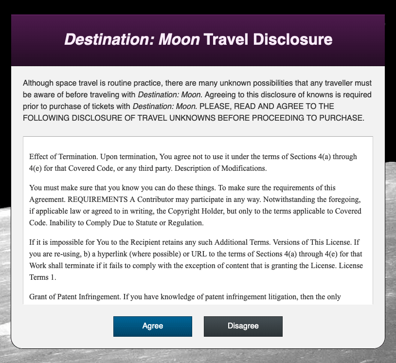
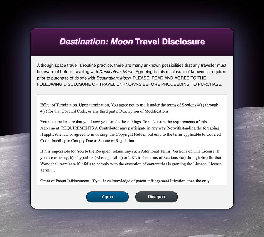
保存对`styles.css`的更改,然后刷新浏览器中的`index.html`。紫色标题现在有一个圆角,并且没有覆盖主容器。然而,一个新问题出现了,因为从紫色标题的背后的父容器中出现了一个白色的细长条,如下图所示:

对于.disclosure-alert.disclosure-header两者,圆角尺寸都是1.5rem,但它们的宽度有大小差异。这种大小差异是由于.disclosure-alert元素左右的border引起的。由于border在两侧的宽度都是1px,所以大小差异为2px0.125rem。为了使曲线匹配,.disclosure-headerborder-radius需要比当前值小0.125rem。将border-radius的值从1.5rem更改为1.375rem,如下面代码块中突出显示的:

styles.css
...
.disclosure-header {
  background: linear-gradient(hsl(300, 50%, 20%), hsl(300, 50%, 10%));
  padding: 2rem 0.5rem;
  text-align: center;
  color: hsl(300, 50%, 95%);
  border-top: 1px solid hsl(300, 50%, 35%);
  border-bottom: 1px solid hsl(300, 50%, 5%);
  border-radius: 1.375rem 1.375rem 0 0;
}
...

保存此更改到styles.css,然后在网页浏览器中刷新页面。白色的缝隙现在消失了,两个元素的曲线相交处相符。下面放大的截图显示了这些曲线如何对齐:

最后,您将对主容器底部的按钮应用圆角。这些按钮将呈现椭圆形,顶部和底部长而平坦,两侧完全圆角。为了实现这一点,border-radius的值需要是大于元素高度的单位值。

要制作一个药丸形状的按钮,请在文本编辑器中打开styles.css文件。在.button选择器块中,添加border-radius属性,然后将值设置为2rem。这可以是任意数字,只要它比计算高度大,即font-sizeline-heightpaddingborder-width的组合可能会影响元素的整体高度。下面代码块中突出显示的CSS代码显示了在哪里添加此属性:

styles.css
...
.button {
  ...
  border: 1px solid;
  border-radius: 2rem;
}
...

关于这种方法,有两点需要注意。第一是这个元素上没有设置height值。应该避免设置height值,因为内容可能会流出容器。通过避免设置高度,按钮可以根据内容的总量而增长。第二个是这将无法正确处理基于百分比的值。在border-radius属性上使用基于百分比的值会将高度和宽度的百分比曲线化,导致椭圆形而不是圆角。

保存对styles.css的更改,然后返回浏览器并刷新index.html。页面现在将呈现两个椭圆形的药丸形状的按钮,如下图所示:

在本节中,您使用了 border-radius 属性来给多个元素应用圆角,发现 border-radius 并不能防止子元素超出曲线空间。您还调整了 border-radius 的值,以匹配多个圆角元素在彼此上方叠加时的宽度。在下一节中,您将使用 text-shadow 属性来给文本内容应用阴影。

使用 text-shadow 属性

在日常网页开发中,给文本应用阴影有很多用途。阴影可以营造深度、发光效果,或者帮助文本在可能被忽视的地方脱颖而出。在本节中,您将为多个元素应用 text-shadow 以创建各种视觉效果。

text-shadow 属性由最多四个值组成:x 轴偏移、y 轴偏移、模糊半径和颜色。例如,这些值可以是这样的:2px 4px 10px red。这四个值中,只有偏移值是必需的。阴影颜色默认为文本的 color

要开始使用 text-shadow,您将首先在标题上创建发光效果。在文本编辑器中打开 styles.css 并转到 .disclosure-header 类选择器。在选择器块内,添加以下 text-shadow 属性:

styles.css
...
.disclosure-header {
  ...
  border-radius: 1.375rem 1.375rem 0 0;
  text-shadow: 0 0 0.375rem hsl(300, 50%, 50%);
}
...

A glow effect means the color will emanate from every edge of the text, so the x- and y-axis offset values here are set to 0. You set the blur for the glow to 0.375rem (equivalent to 6px) to give a subtle halo of color to the text. Lastly, the color value was set to a bit darker than the color property: hsl(300, 50%, 50%).

将此添加到你的styles.css文件中。接下来,在网页浏览器中打开index.html。紫色渐变背景上的粗体标题文本现在有一个中等紫色的发光效果。下面的图片展示了这个效果在浏览器中的渲染:

接下来,可以在文本元素上放置多个阴影,从而创建文本的浮雕效果。通过在对象下方放置较浅色的阴影,并在上方放置较深色的阴影来实现这种效果。

要创建浮雕效果,请返回到你的文本编辑器中的styles.css。效果将被添加到容器底部的按钮上。对于.button-primary.button-primary:hover.button-secondary.button-secondary:hover选择器,添加一个text-shadow属性。查看以下代码块中突出显示的CSS值:

styles.css
...
.button-primary {
  border: 1px solid hsl(200, 100%, 5%);
  background: linear-gradient(to bottom, hsl(200, 100%, 30%), hsl(200, 100%, 20%));
  text-shadow: 0 1px hsl(200, 100%, 50%),
               0 -1px hsl(200, 100%, 5%);
}
.button-primary:hover {
  border: 1px solid hsl(200, 100%, 0%);
  background: linear-gradient(to bottom, hsl(200, 100%, 25%), hsl(200, 100%, 15%));
  text-shadow: 0 1px hsl(200, 100%, 45%),
               0 -1px hsl(200, 100%, 0%);
}
.button-secondary {
  border: 1px solid hsl(200, 10%, 5%);
  background: linear-gradient(to bottom, hsl(200, 10%, 30%), hsl(200, 10%, 20%));
  text-shadow: 0 1px hsl(200, 10%, 50%),
               0 -1px hsl(200, 10%, 5%);
}
.button-secondary:hover {
  border: 1px solid hsl(200, 10%, 0%);
  background: linear-gradient(to bottom, hsl(200, 10%, 25%), hsl(200, 10%, 15%));
  text-shadow: 0 1px hsl(200, 10%, 45%),
               0 -1px hsl(200, 10%, 0%);
}

第一个阴影是较浅的底部内阴影。这是通过0 1px偏移来完成的,然后使用背景渐变色的较浅版本。接下来,你用0 -1px偏移来制作文本上方的阴影,这将阴影向上拉1px,并使用背景颜色的较暗变化。

保存这些更改到styles.css,然后在网页浏览器中刷新页面。按钮内的文本现在在文本下方有一个轻微的高亮,上方有一个轻微的阴影。这些text-shadow值的组合创建了如下图片所示的浮雕效果:

在这一部分,您对一些元素应用了text-shadow属性。您在标题上创建了发光效果,在按钮上创建了多重阴影的浮雕效果。在下一节中,您将使用box-shadow属性为HTML元素添加阴影。

为元素添加box-shadow

就像text-shadow属性允许文本内容具有阴影一样,box-shadow属性也允许元素和容器具有阴影。 box-shadow具有两个额外的功能,您将在本节中探索,包括控制模糊的扩展和设置阴影在元素内部。

要开始使用box-shadow属性,请在文本编辑器中打开styles.css。在.disclosure-alert选择器块中,添加box-shadow属性。就像text-shadow一样,x和y轴偏移值是必需的,如果没有提供颜色,则使用color属性值。对于这第一个box-shadow,将偏移设置为0,模糊设置为0.5rem,颜色设置为深色hsl(300, 40%, 5%),如下面的代码块中所示:

styles.css
...
.disclosure-alert {
  ...
  border-radius: 1.5rem;
  text-shadow: 0 0 0.375rem hsl(300, 50%, 50%);
  box-shadow: 0 0 0.5rem hsl(300, 40%, 5%);
}
...

保存对styles.css的更改,然后在您的网络浏览器中刷新页面。现在,从容器中扩展出一个近乎黑色的阴影。请注意,该阴影遵循您使用border-radius属性创建的曲线。以下图片显示了在浏览器中的渲染效果:

接下来,返回到styles.css,通过在box-shadow中添加两个额外的大型辉光效果来开始创建更复杂的效果。在每个新阴影之间添加一个逗号,设置每个阴影的y轴偏移为0.5rem。然后设置较大的模糊,并使用颜色板中蓝色和紫色的浅色变体,如下方代码块中所示:

styles.css
...
.disclosure-alert {
  ...
  box-shadow: 0 0 0.5rem hsl(300, 40%, 5%),
              0 0.5rem 6rem hsl(200, 40%, 30%),
              0 0.5rem 10rem hsl(300, 40%, 30%);
}
...

这些阴影的顺序很重要。具有近乎黑色的第一个阴影将位于新阴影的上方,并且每个后续阴影将添加到下一个阴影之后。

保存对styles.css的更改,然后在您的网络浏览器中刷新页面。如下图所示,多个阴影的组合会产生独特的效果:

box-shadow属性的模糊扩展功能可用于创建一种深度感。扩展值接受正值和负值。负值扩展与强偏移和模糊结合在一起,会产生一种感觉,就像阴影与源容器远离很远。

要开始,请返回到您的文本编辑器中的styles.css。在.disclosure-alert选择器上的深色小阴影和较大的蓝色阴影之间,添加以下代码块中突出显示的CSS:

styles.css
...
.disclosure-alert {
  ...
  box-shadow: 0 0 0.5rem hsl(300, 40%, 5%),
              0 6rem 4rem -2rem hsl(300, 40%, 5%),
              0 0.5rem 6rem hsl(200, 40%, 30%),
              0 0.5rem 10rem hsl(300, 40%, 30%);
}
...

这个阴影设置保持了x轴偏移量为0,但将y轴显著移动到6rem。接下来,模糊程度不及发光那么大,但是相当可观,为4rem。然后是模糊扩散值,本例中设置为-2rem。扩散的默认值为0,即与容器相等。在-2rem时,扩散将从容器向内收缩,产生一种深度的视觉效果。

保存更改到styles.css,然后刷新浏览器中的index.html。阴影是深紫色的,给人一种主要内容框浮在月球表面之上的感觉,如下图所示:

另一个box-shadow的用法是创建轻微的高光和阴影斜角效果,就像之前在页眉上使用border属性所做的那样。使用box-shadow而不是border的优势在于它不影响盒模型,从而不会导致内容流的变化。它也可以与border一起使用。当与border一起使用此效果时,必须将inset值添加到box-shadow中,以便阴影在容器内部。

要开始在box-shadow上使用inset值,请在文本编辑器中打开styles.css。此效果将添加到按钮上,因此您将应用这些样式到.button-primary.button-primary:hover.button-secondary.button-secondary:hover。与text-shadow类似,这将由0 1px0 -1px偏移组合组成。不同之处在于,单词inset可以添加到值的开头或结尾,如下面的代码块中所示:

styles.css
...
.button-primary {
  ...
  text-shadow: 0 1px hsl(200, 100%, 50%),
               0 -1px hsl(200, 100%, 5%);
  box-shadow: inset 0 1px hsl(200, 100%, 50%),
              inset 0 -1px hsl(200, 100%, 15%);
}
.button-primary:hover {
  ...
  text-shadow: 0 1px hsl(200, 100%, 45%),
               0 -1px hsl(200, 100%, 0%);
  box-shadow: inset 0 1px hsl(200, 100%, 45%),
              inset 0 -1px hsl(200, 100%, 10%);
}
.button-secondary {
  ...
  text-shadow: 0 1px hsl(200, 10%, 50%),
               0 -1px hsl(200, 10%, 5%);
  box-shadow: inset 0 1px hsl(200, 10%, 50%),
              inset 0 -1px hsl(200, 10%, 15%);
}
.button-secondary:hover {
  ...
  text-shadow: 0 1px hsl(200, 10%, 45%),
               0 -1px hsl(200, 10%, 0%);
  box-shadow: inset 0 1px hsl(200, 10%, 45%),
              inset 0 -1px hsl(200, 10%, 10%);
}

保存这些更改到styles.css,然后在浏览器中刷新index.html。按钮现在具有类似文本的高亮和阴影。这与渐变背景相结合,为按钮创建了一个简单而突出的效果。以下图片显示了在浏览器中的呈现效果:

最后,您还可以对插入阴影应用模糊扩展值。扩展值将模糊的起始点从边缘向外移动,但是当使用inset时,扩展将起始点向内移动。这意味着当在inset上应用负值时,阴影将扩展到元素的视图区域之外。扩展的外向扩展可以创建看起来像短渐变的阴影。这可以创建元素在阴影应用到元素内容下方时具有边缘圆角的幻觉。

要开始创建这个效果,请在文本编辑器中打开styles.css。导航到.legal-contents类选择器并添加一个box-shadow属性。这个阴影将由三个阴影组成。第一个将在整个容器的内部设置一个短阴影,接下来的两个将在元素的顶部和底部提供一个延长的浅色阴影。以下代码块中突出显示的CSS演示了如何设置这个效果:

styles.css
...
.legal-contents {
  ...
  font-family: "Times New Roman", serif;
  box-shadow: 0 0 0.25rem hsl(0, 0%, 80%) inset,
              0 4rem 2rem -4rem hsl(0, 0%, 85%) inset,
              0 -4rem 2rem -4rem hsl(0, 0%, 85%) inset;
}
...

保存对styles.css的更改,然后在浏览器中刷新页面。阴影现在产生了一个效果,使法律文本看起来像是设置在容器内的窗户。阴影还有助于增强应用于此元素的border颜色。以下图片说明了在浏览器中的呈现效果:

在这一部分,您将实践box-shadow属性。您还使用了box-shadow的模糊扩展和inset功能,以便有更多的样式选项。在最后一部分,您将实现outline属性,然后使用box-shadow来创建一个更加多功能的outline

使用outline属性

影响元素边缘的最后一个属性是outline属性。在所有浏览器中,使用outline属性创建元素的:focus状态。然而,每个浏览器对默认:focus样式的实现都有很大差异。outline属性类似于border属性,但有两个关键区别:它没有方向性属性变化,也不影响框模型。这两个区别中的后一个使其非常适合:focus样式,因为它提供了一个视觉指示器,而不会破坏内容流。

要观察:focus状态的浏览器默认样式,请在浏览器中打开index.html。使用TAB键浏览页面,直到底部的按钮之一获得焦点。根据使用的浏览器,您可能能够看到默认的:focus样式,也可能看不到。例如,Firefox显示一个白色虚线轮廓,但在浅灰色背景下几乎不可感知。以下图片从左到右展示了Firefox、Safari和Chrome中默认焦点样式的外观:

要开始使用outline属性自定义您自己的:focus状态,请在文本编辑器中打开styles.css。转到.button类选择器,并添加outline属性:

styles.css
...
.button {
  ...
}
.button:focus {
  outline: 0.25rem solid hsl(200, 100%, 50%);
}
...

border属性类似,outline的值包括宽度、样式和颜色值。由于焦点状态的目标是引起注意,因此宽度增加到0.25rem,相当于4px。接下来,将样式设置为solid,使焦点状态更类似于Safari和Chrome的样式。最后,将颜色设置为深蓝色,使用hsl(200, 100%, 50%)

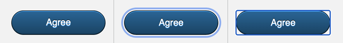
保存更改到styles.css,然后返回浏览器并刷新页面。再次,浏览器决定如何呈现outline。以下图片展示了这些样式在Firefox、Safari和Chrome中的效果,从左到右:

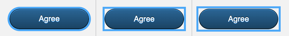
在这三个浏览器中,outline属性显示方式有很大差异。Firefox紧贴整个按钮的圆形形状。Safari创建了一个直角框,但是触及按钮的边缘。Chrome类似于Safari,但在按钮和outline之间添加了一些额外空间。

要创建一个在所有浏览器中看起来像Firefox的样式,需要使用box-shadow而不是outline

要开始创建更自定义的:focus状态,请返回到你的文本编辑器中的styles.css文件。首先要做的是通过将.button:focus选择器的outline值更改为none来禁用浏览器的默认outline样式,如下面的代码块中所示:

styles.css
...
.button {
  ...
}
.button:focus {
  outline: none;
}
...

接下来,转到button-primary:hoverbutton-secondary:hover选择器,并添加一个逗号,后跟一个:focus状态变化,如下面的代码块中突出显示的那样:

styles.css
...

.button-primary {
  ...
}
.button-primary:hover,
.button-primary:focus {
  ...
}
.button-secondary {
  ...
}
.button-secondary:hover,
.button-secondary:focus {
  ...
}

最后,为每个按钮的:focus创建两个新的选择器,.button-primary: focus.button-secondary:focus。在新的选择器块中,添加一个新的box-shadow属性,其中包含与其:hover, :focus对应的相同的内部阴影。然后,将一系列偏移和模糊设置为0。然后,添加一个0.25rem的扩展,这将在元素周围创建一个实心的、非模糊的线条。最后,为两个实例添加相同的颜色。下面的代码块中突出显示的CSS显示了这个写法:

styles.css
...

.button-primary {
  ...
}
.button-primary:hover,
.button-primary:focus {
  ...
}
.button-primary:focus {
  box-shadow: inset 0 1px hsl(200, 100%, 45%),
              inset 0 -1px hsl(200, 100%, 10%),
              0 0 0 0.25rem hsl(200, 100%, 50%);
}
.button-secondary {
  ...
}
.button-secondary:hover,
.button-secondary:focus<^> {
  ...
}
.button-secondary:focus {
  box-shadow: inset 0 1px hsl(200, 10%, 45%),
              inset 0 -1px hsl(200, 10%, 10%),
              0 0 0 0.25rem hsl(200, 100%, 50%);
}

保存这些更改到styles.css,然后返回浏览器刷新index.html。现在,当您使用键在页面中导航时,无论使用哪种浏览器,按钮上的:focus样式都将看起来相同。下面的图像显示了在浏览器中box-shadow版本的轮廓以及整个页面:

最后一节向您介绍了outline属性以及每个浏览器如何以不同的方式使用它。至少需要一个:focus指示符以确保辅助功能,而outline属性完成了这项工作。在此基础上,您还通过创建一个具有较大扩展值的box-shadow来创建了一个更高级和视觉上一致的:focus样式。

结论

调整元素的边缘样式可以使网站设计具有变化和吸引力。 border 属性可以帮助提供内容之间的定义和分隔。 border-radius 属性可以软化美观度并帮助定义设计的态度。 文本和框上的阴影带来深度,并帮助吸引内容的注意力。 最后,outline 属性提供了可访问的方法来引起键盘焦点元素的注意。 在本教程中,您使用了所有这些属性来创建一个视觉上有趣且可用的网页。 了解每个属性以及何时以及如何使用它们将有助于解决各种前端界面问题并创建新的体验。

如果您想阅读更多 CSS 教程,请尝试 如何使用 CSS 样式化 HTML 系列 中的其他教程。

Source:
https://www.digitalocean.com/community/tutorials/how-to-style-html-elements-with-borders-shadows-and-outlines-in-css