


このチュートリアルでは、Kotlinを使用してAndroidアプリケーションにAlert Dialogsを実装する方法について説明します。
Alert Dialogs
Alert Dialogは画面にポップアップするウィンドウです。通常、情報を表示し、ユーザーのアクションを求めます。Alert Dialogを構築する3つの主要なコンポーネントがあります。
- タイトルテキスト
- メッセージテキスト
- ボタン-ポジティブ、ネガティブ、およびニュートラルの3種類のボタンがあります。
AlertDialogを作成するには、AlertDialog.Builderの内部クラスを使用します。
val alertDialogBuilder = AlertDialog.Builder(this)
コンストラクタ内にコンテキストを渡します。オプションで、アラートダイアログのスタイルを別のパラメータとして渡すこともできます。
Alert Dialogメソッド
AlertDialogで使用できるいくつかのメソッド。
- setTitle
- setMessage
- setIcon
- setCustomTitle-ここでは、タイトル部分の代わりに配置されるカスタムビューを渡すことができます。
- setPositiveButton-ここでは、文字列名とボタンのクリックコールバックメソッドを渡します。
- setView-アラートダイアログ内にカスタムビューを追加するために使用されます。
- setList – リスト形式で表示される文字列の配列を設定するために使用されます。
- setMultiChoiceList – 再び配列を設定しますが、今度はチェックボックスによってリストから複数のアイテムを選択できます。
- setPositiveButtonIcon – ボタンの横にアイコンを設定します。
- show() – AlertDialogを表示するために使用されます。
- setDismissListener – この中で、アラートダイアログが閉じられたときにトリガーされるロジックを設定できます。
- setShowListener – アラートダイアログが表示されたときにトリガーされるロジックを設定します。
- setCancelable – boolean値が必要です。デフォルトでは、すべてのアラートダイアログはボタンクリックまたは外部タッチでキャンセルできます。このメソッドがfalseに設定されている場合、dialog.cancel()メソッドを明示的に使用してダイアログをキャンセルする必要があります。
Alert Dialog Kotlin Code
Android StudioプロジェクトでAlertDialogを使用するには、次のクラスをインポートします。
import android.support.v7.app.AlertDialog;
次のKotlinコードは、シンプルなアラートダイアログを作成するために使用されます。
val builder = AlertDialog.Builder(this)
builder.setTitle("Androidly Alert")
builder.setMessage("We have a message")
//builder.setPositiveButton("OK", DialogInterface.OnClickListener(function = x))

builder.setPositiveButton(android.R.string.yes) { dialog, which ->
    Toast.makeText(applicationContext,
            android.R.string.yes, Toast.LENGTH_SHORT).show()
}

builder.setNegativeButton(android.R.string.no) { dialog, which ->
    Toast.makeText(applicationContext,
            android.R.string.no, Toast.LENGTH_SHORT).show()
}

builder.setNeutralButton("Maybe") { dialog, which ->
    Toast.makeText(applicationContext,
            "Maybe", Toast.LENGTH_SHORT).show()
}
builder.show()
builder.show()は、Alert Dialogを画面に表示します。 setPositiveButton関数の内部では、ボタンのテキストと共に、そのボタンがクリックされたときにトリガされるKotlin関数を渡します。 この関数はDialogInterface.OnClickListener()インターフェースの一部です。 関数の型は(DialogInterface, Int) -> Unitです。 DialogInterfaceはダイアログのインスタンスであり、IntはクリックされたボタンのIDです。 上記のコードでは、この関数を高階Kotlin関数として表しています。 dialogとwhichは2つの引数を表します。 引数が使用されない場合は、_を渡すことで関数を改善することができます。 関数は次のようになります:
builder.setPositiveButton(android.R.string.yes) { _,_ ->
            Toast.makeText(applicationContext,
                    android.R.string.yes, Toast.LENGTH_SHORT).show()
        }
または、AlertDialogクラスのインスタンスを使用してダイアログを表示することもできます。 builder.show()を次のように置き換えます:
val alertDialog = builder.create()
alertDialog.show()
各ボタンのボタンクリックリスナー関数を定義する代わりに、高階関数を別々に定義することもできます。
val positiveButtonClick = { dialog: DialogInterface, which: Int ->
    Toast.makeText(applicationContext,
            android.R.string.no, Toast.LENGTH_SHORT).show()
}
次に、このvalプロパティをsetPositiveButton Kotlin関数の内部で設定します:
builder.setPositiveButton("OK", DialogInterface.OnClickListener(function = positiveButtonClick))
//or
builder.setPositiveButton(android.R.string.yes, positiveButtonClick)
後者の方がコードが簡潔になります。以下は、上記の関数が各ボタンに適用されたActivityクラスのスクリーンショットです。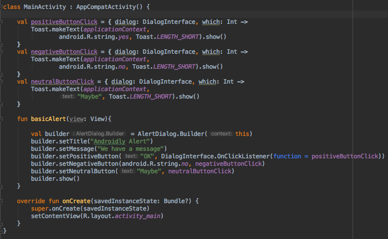
ボタンクリック時にアクションを行わない場合は、関数の代わりにnullを渡すこともできます。
Kotlinには、上記のコードの読みやすさを向上させるためのさらなる機能があります。
シンプルなアラートダイアログのKotlinコード
Kotlinコードの可読性を向上させるために、with関数を使用してアラートダイアログを作成できます。
fun basicAlert(view: View){

        val builder = AlertDialog.Builder(this)

        with(builder)
        {
            setTitle("Androidly Alert")
            setMessage("We have a message")
            setPositiveButton("OK", DialogInterface.OnClickListener(function = positiveButtonClick))
            setNegativeButton(android.R.string.no, negativeButtonClick)
            setNeutralButton("Maybe", neutralButtonClick)
            show()
        }


    }
次のセクションでは、以下の機能を実装するAndroidアプリケーションを作成します。
- シンプルなアラートダイアログ
- アイコンとボタンのカスタマイズが可能なアラートダイアログ
- リストを持つアラートダイアログ
- 複数選択リストを持つアラートダイアログ
- スタイルを持つアラートダイアログ
- カスタムスタイルを持つアラートダイアログ
- テキスト入力を持つアラートダイアログ
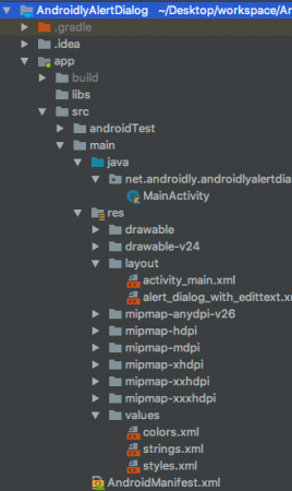
Android Studioプロジェクトの構造
1. XMLレイアウトコード
activity_main.xmlレイアウトのコードは以下の通りです。
<?xml version="1.0" encoding="utf-8"?>
<LinearLayout xmlns:android="http://schemas.android.com/apk/res/android"
    xmlns:tools="http://schemas.android.com/tools"
    android:layout_width="match_parent"
    android:layout_height="match_parent"
    android:gravity="center"
    android:orientation="vertical"
    tools:context=".MainActivity">

    <Button
        android:id="@+id/btnBasicAlert"
        android:layout_width="wrap_content"
        android:onClick="basicAlert"
        android:layout_height="wrap_content"
        android:text="BASIC ALERT DIALOG" />


    <Button
        android:id="@+id/btnAlertWithIconsAndCustomize"
        android:layout_width="wrap_content"
        android:onClick="withIconAndCustomise"
        android:layout_height="wrap_content"
        android:text="WITH ICON AND CUSTOMIZATION" />

    <Button
        android:id="@+id/btnAlertWithItems"
        android:layout_width="wrap_content"
        android:layout_height="wrap_content"
        android:onClick="withItems"
        android:text="WITH ITEMS" />

    <Button
        android:id="@+id/btnAlertWithMultiChoiceList"
        android:layout_width="wrap_content"
        android:layout_height="wrap_content"
        android:onClick="withMultiChoiceList"
        android:text="WITH MULTI CHOICE LIST" />

    <Button
        android:id="@+id/btnAlertWithStyle"
        android:layout_width="wrap_content"
        android:layout_height="wrap_content"
        android:onClick="withStyle"
        android:text="WITH STYLE" />


    <Button
        android:id="@+id/btnAlertWithCustomStyle"
        android:layout_width="wrap_content"
        android:layout_height="wrap_content"
        android:onClick="withCustomStyle"
        android:text="WITH CUSTOM STYLE" />

    <Button
        android:id="@+id/btnAlertWithButtonCentered"
        android:layout_width="wrap_content"
        android:layout_height="wrap_content"
        android:onClick="withButtonCentered"
        android:text="WITH BUTTON CENTERED" />

    <Button
        android:id="@+id/btnAlertWithEditText"
        android:layout_width="wrap_content"
        android:layout_height="wrap_content"
        android:onClick="withEditText"
        android:text="WITH EDIT TEXT" />


</LinearLayout>
各ボタンには、android:onClick属性と関数名が設定されています。これらのKotlin関数はMainActivity.ktクラスでトリガーされます。それぞれについて順番に説明します。
2. Kotlinメインアクティビティのコード
すでに最初のAlert Dialogを作成しました。それを使用したMainActivity.ktの見方を見てみましょう。
package net.androidly.androidlyalertdialog

import android.content.DialogInterface
import android.support.v7.app.AppCompatActivity
import android.os.Bundle
import android.support.v7.app.AlertDialog
import android.view.View
import android.widget.Toast

class MainActivity : AppCompatActivity() {

    val positiveButtonClick = { dialog: DialogInterface, which: Int ->
        Toast.makeText(applicationContext,
                android.R.string.yes, Toast.LENGTH_SHORT).show()
    }
    val negativeButtonClick = { dialog: DialogInterface, which: Int ->
        Toast.makeText(applicationContext,
                android.R.string.no, Toast.LENGTH_SHORT).show()
    }
    val neutralButtonClick = { dialog: DialogInterface, which: Int ->
        Toast.makeText(applicationContext,
                "Maybe", Toast.LENGTH_SHORT).show()
    }

    override fun onCreate(savedInstanceState: Bundle?) {
        super.onCreate(savedInstanceState)
        setContentView(R.layout.activity_main)
    }

    fun basicAlert(view: View){

        val builder = AlertDialog.Builder(this)

        with(builder)
        {
            setTitle("Androidly Alert")
            setMessage("We have a message")
            setPositiveButton("OK", DialogInterface.OnClickListener(function = positiveButtonClick))
            setNegativeButton(android.R.string.no, negativeButtonClick)
            setNeutralButton("Maybe", neutralButtonClick)
            show()
        }


    }
}
3. アイコンとカスタマイズを持つAlert Dialog
val builder = AlertDialog.Builder(this)
        with(builder) {
            setTitle("Icon and Button Color")
            setMessage("We have a message")
            setPositiveButton("OK", null)
            setNegativeButton("CANCEL", null)
            setNeutralButton("NEUTRAL", null)
            setPositiveButtonIcon(resources.getDrawable(android.R.drawable.ic_menu_call, theme))
            setIcon(resources.getDrawable(android.R.drawable.ic_dialog_alert, theme))
        }
        val alertDialog = builder.create()
        alertDialog.show()

        val button = alertDialog.getButton(DialogInterface.BUTTON_POSITIVE)
        with(button) {
            setBackgroundColor(Color.BLACK)
            setPadding(0, 0, 20, 0)
            setTextColor(Color.WHITE)
        }
getButtonを使用すると、各ボタンの定数を設定して任意のボタンを取得できます。ボタンを取得したら、上記のようにカスタマイズできます。
4. 項目を持つAlert Dialog
fun withItems(view: View) {

        val items = arrayOf("Red", "Orange", "Yellow", "Blue")
        val builder = AlertDialog.Builder(this)
        with(builder)
        {
            setTitle("List of Items")
            setItems(items) { dialog, which ->
                Toast.makeText(applicationContext, items[which] + " is clicked", Toast.LENGTH_SHORT).show()
            }

            setPositiveButton("OK", positiveButtonClick)
            show()
        }
    }
setItemsの中にはKotlinの配列を渡します。 which引数は、リスト内でクリックされた要素のインデックスを表します。
5. マルチチョイスリストを持つAlert Dialog
fun withMultiChoiceList(view: View) {

        val items = arrayOf("Microsoft", "Apple", "Amazon", "Google")
        val selectedList = ArrayList<Int>()
        val builder = AlertDialog.Builder(this)

        builder.setTitle("This is list choice dialog box")
        builder.setMultiChoiceItems(items, null
        ) { dialog, which, isChecked ->
            if (isChecked) {
                selectedList.add(which)
            } else if (selectedList.contains(which)) {
                selectedList.remove(Integer.valueOf(which))
            }
        }

        builder.setPositiveButton("DONE") { dialogInterface, i ->
            val selectedStrings = ArrayList<string>()

            for (j in selectedList.indices) {
                selectedStrings.add(items[selectedList[j]])
            }

            Toast.makeText(applicationContext, "Items selected are: " + Arrays.toString(selectedStrings.toTypedArray()), Toast.LENGTH_SHORT).show()
        }

        builder.show()

    }
上記のコードでは、選択肢を整数の配列リストに保存し、再び取得してToastメッセージに表示します。
6. スタイル付きのアラートダイアログ
fun withStyle(view: View) {

        val builder = AlertDialog.Builder(ContextThemeWrapper(this, android.R.style.Holo_SegmentedButton))

        with(builder)
        {
            setTitle("Androidly Alert")
            setMessage("We have a message")
            setPositiveButton("OK", DialogInterface.OnClickListener(function = positiveButtonClick))
            setNegativeButton(android.R.string.no, negativeButtonClick)
            setNeutralButton("Maybe", neutralButtonClick)
            show()
        }
    }
ContextThemeWrapperを使用しない場合、アラートダイアログはフルスクリーンで表示されます。
7. カスタムスタイルのアラートダイアログ
styles.xmlファイルに以下のコードを追加します:
<style name="AlertDialogCustom" parent="@android:style/Theme.Material.Dialog">
        <item name="android:textColor">@android:color/white</item>
        <item name="android:textStyle">bold</item>
        <item name="android:headerDividersEnabled">true</item>
        <item name="android:background">@android:color/holo_blue_dark</item>
    </style>
以下はKotlinの関数です:
fun withCustomStyle(view: View) {

        val builder = AlertDialog.Builder(ContextThemeWrapper(this, R.style.AlertDialogCustom))

        with(builder)
        {
            setTitle("Androidly Alert")
            setMessage("We have a message")
            setPositiveButton("OK", DialogInterface.OnClickListener(function = positiveButtonClick))
            setNegativeButton(android.R.string.no, negativeButtonClick)
            setNeutralButton("Maybe", neutralButtonClick)
            show()
        }

    }
8. ボタンが中央に配置されたアラートダイアログ
fun withButtonCentered(view: View) {

        val alertDialog = AlertDialog.Builder(this).create()
        alertDialog.setTitle("Title")
        alertDialog.setMessage("Message")

        alertDialog.setButton(AlertDialog.BUTTON_POSITIVE, "Yes"
        ) { dialog, which -> dialog.dismiss() }

        alertDialog.setButton(AlertDialog.BUTTON_NEGATIVE, "No"
        ) { dialog, which -> dialog.dismiss() }
        alertDialog.show()

        val btnPositive = alertDialog.getButton(AlertDialog.BUTTON_POSITIVE)
        val btnNegative = alertDialog.getButton(AlertDialog.BUTTON_NEGATIVE)

        val layoutParams = btnPositive.layoutParams as LinearLayout.LayoutParams
        layoutParams.weight = 10f
        btnPositive.layoutParams = layoutParams
        btnNegative.layoutParams = layoutParams
    }
9. 編集テキスト付きのアラートダイログ
カスタムレイアウトのalert_dialog_with_edittext.xmlのコードは以下のとおりです:
<?xml version="1.0" encoding="utf-8"?>
<LinearLayout xmlns:android="http://schemas.android.com/apk/res/android"
    android:orientation="vertical"
    android:layout_width="match_parent"
    android:layout_height="match_parent">

    <EditText
        android:id="@+id/editText"
        android:layout_width="match_parent"
        android:layout_height="wrap_content"
        android:hint="Enter the text here"/>

</LinearLayout>
fun withEditText(view: View) {
        val builder = AlertDialog.Builder(this)
        val inflater = layoutInflater
        builder.setTitle("With EditText")
        val dialogLayout = inflater.inflate(R.layout.alert_dialog_with_edittext, null)
        val editText  = dialogLayout.findViewById<EditText>(R.id.editText)
        builder.setView(dialogLayout)
        builder.setPositiveButton("OK") { dialogInterface, i -> Toast.makeText(applicationContext, "EditText is " + editText.text.toString(), Toast.LENGTH_SHORT).show() }
        builder.show()
    }
上記のアプリケーションの出力は以下のとおりです: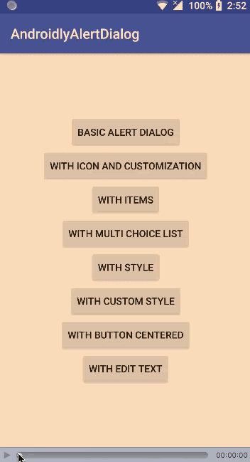
Android Studioプロジェクトをダウンロードします:AndroidlyAlertDialog
Source:
https://www.digitalocean.com/community/tutorials/android-alert-dialog-using-kotlin